Budget cuts can be inspirational. Just ask Robert Kuehler, assistant vice president and university controller, who after several years of department rollbacks, zeroed in on the cost of printing the University of Colorado audited financial report.
“We produced several hundred copies, most of which would stay in our file room,” he explains, “but even doing 100 color copies cost us in excess of $5,000. Out of an operating budget of $20,000, that was a pretty big hit. I decided to look for other ways to get our information out there, without having to incur that much expense. Being an accountant, I immediately thought of just having it printed in black and white and distributed as a PDF.”
That would be cheaper and more efficient, he reasoned.
Fortunately, when other staff members expressed a different, innovative solution, he listened—and liked what he heard.
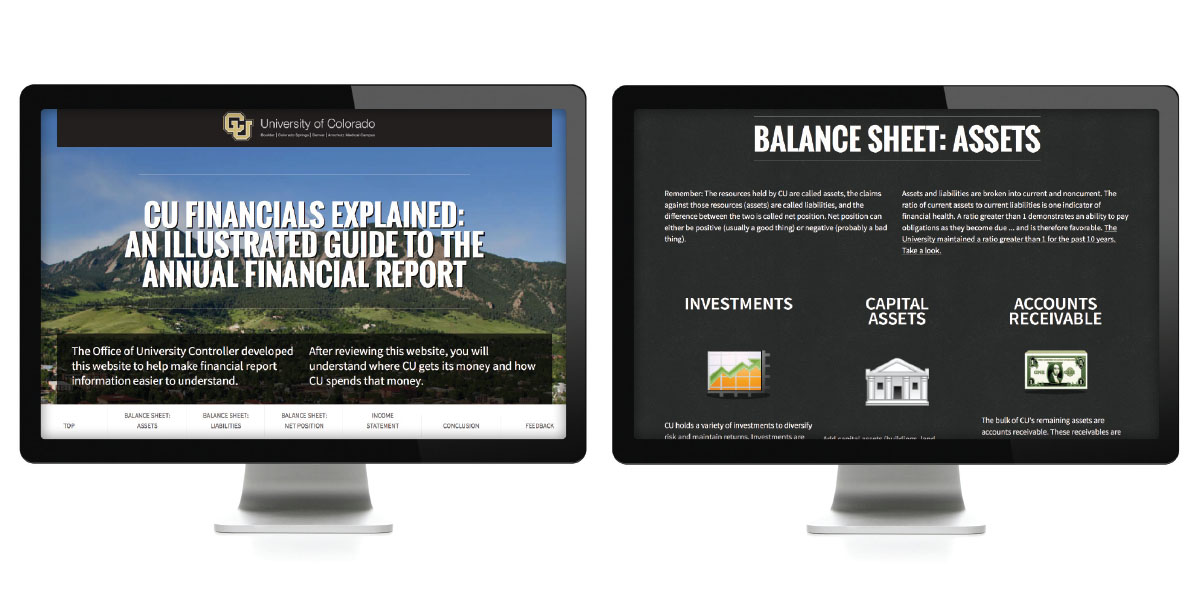
The team’s solution: Why not produce an HTML version of the 2013 annual financial report for the rating agencies, the state, federal funding agencies, and the public, and then create an additional, all-new, and easy-to-understand version for nonaccountants who may not know their way around a balance sheet?
So that’s what they did. And their creative and effective effort earned recognition with one of NACUBO’s 2014 Innovation Awards, which were presented at the NACUBO 2014 Annual Meeting held earlier this year.
HTML Allows Latitude
Trying that approach opened two doors that had been slammed shut, emphasizes Travis Chillemi, strategic communications technology manager.
“We could restore features from previous versions—such as color, graphs, and charts—that were taken out because of cost,” he says. “We could also add new functionality, such as giving readers the ability to view notes immediately, as opposed to having to flip through a virtual PDF of 80 or 90 pages. Once we were in the HTML boat, we really had a lot of latitude in terms of adding features to make it easy for people to navigate.”
Before proceeding too far with the dual project, Kuehler floated the innovative idea up the chain of command. “When Bob presented the idea early on, it sounded promising, but we weren’t sure how all the agencies using the financial report would respond to it,” explains Geoff Barsch, associate vice president and chief business officer. “Our primary stakeholders are our auditors and the state auditor’s office. We needed to work through that.”
Although they didn’t immediately endorse the HTML-based financial statement, the auditors didn’t automatically nix it either. After reviewing a few tweaks of increasingly polished prototypes, the auditors enthusiastically jumped on board.
Why Create Two?
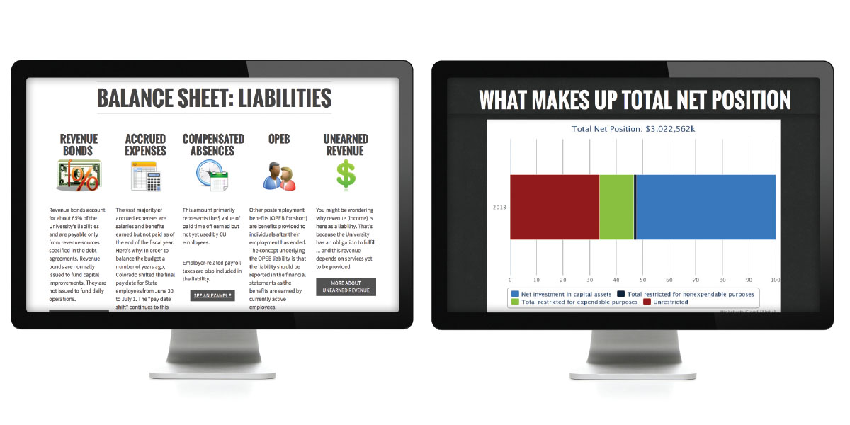
Because accounting standards dictate the precise content of the audited financial statements, the project team created two online documents—a GAAP-based financial statement and a picture-filled companion entitled The Illustrated Guide to the Annual Financial Report.
“It became apparent that it doesn’t matter how you present a set of audited financial statements—they’re still very difficult for a nonaccountant to fully understand and to grasp [with regard to] the underlying concepts,” Kuehler says.
Chillemi concurs. “I am surrounded by accountant types, and I have a fine arts degree in multimedia. When they talk about assets and balance sheets, I hear ‘blah, blah, blah.’ I was putting together our e-report with all of these numbers that seemed very impressive, but I had absolutely no idea of their impact on the university or the state.”
Trying to cast jargon aside, Kuehler took a stab at drafting a layperson’s guide to financial statements. Then Normandy Roden, director of finance and procurement business services, edited the draft for clarity.
“We didn’t know at that time exactly how we would present it, what we would call it, or what form it would take, but we knew we needed something to accompany the annual financial report that would make it understandable to more people,” Kuehler recalls. “Just saying you’re transparent by publishing your financial statements is a pretty empty promise if people don’t understand them.”
Chillemi transformed the easy-to-understand information by creating one long Web page and adding glitz for visual interest. “As you scroll through the illustrated guide, you see images of our campuses in the background and different typography treatments and graphic elements,” he explains. “All of that fits into the parallax design. Parallax refers to the fact that as you scroll down the page, the elements moving up the page move at a different rate from each other and provide visual depth.”


Each of the two online reports targets a different constituency, Barsch clarifies. “The audience for the financial statements includes our investment community, rating agencies, and policy-makers, who like to see our financial position at any given time. The illustrated guide is designed for people who don’t typically read financial statements or, if they do, have lots of questions. We hoped to demystify the financial terms.”
To give potential readers easy access, the university’s redesigned website provides a link from the controller’s office main Web page to the annual financial statements and the illustrated guide.
Production costs were minimal. The software (HTML and Parallax) are free of charge, and the office was fortunate to have on staff someone with the talent and interest to develop these documents. Eliminating the printing costs has allowed Kuehler to invest more money in professional development for the staff.
Not Resting on Their Laurels
The financial team continues to seek improvements in the 2014 editions of the annual financial report and illustrated guide.
These include hyperlinking the human-friendly descriptions of the financial statements in the illustrated guide to the actual statements in the annual report, creating increased navigation options between sections of each website, and introducing additional elements to reduce the need to scroll. The team is exploring new treatment of the complex (and lengthy) information contained in the annual report’s “Notes” section—and new multimedia approaches to invite readers to learn more about the university’s regents and president through the illustrated guide.
One of the more unusual items on Kuehler’s wish list: He’d like to be able to download the files and make notations on them—just as he frequently takes notes now on hard-copy financial reports.
Barsch encourages NACUBO members to visit the University of Colorado website after mid-December, when the new report and guide are published online, to see how the university is making its award-winning documents even better.
Advice for Risk Takers
Throughout the process, the financial team faced a number of technical challenges. “For the illustrated guide, the challenge was to do something interactive and different but still maintain acceptability and device interoperability,” Chillemi says.
For example, after promising that the illustrated guide would work on a tablet, phone, or personal computer, Chillemi routinely tested various iterations in multiple browsers to ensure compatibility. “We had a lot of folks in the office helping out with that, because I don’t own every single tablet and phone. I would ask, ‘Hey, can you guys test this out, and let me know if it works?’ I guess that’s all part of the normal process.”
The resulting guide, according to Roden, sizes to any device, is accessible from anywhere, provides an interactive storytelling experience, and can easily be searched for specific data.
Based on their initial yearlong effort, the four-person team offers this advice:
- Put first things first. “We brought in our external auditors as soon as this idea emerged,” Kuehler says. “Quite honestly, we did not know if they would allow us to do this, and if you don’t have the support of your external audit firm, it’s not worth starting.”
Roden indicates that officials at other state agencies have been so impressed with the final product that they are now considering moving the state’s financials in the same direction.
- Allow construction time. Your first effort will take the longest, predicts Chillemi. However, once you have the technical foundation in place, you can quickly build upon it in future years. “We can very rapidly put in new information and new numbers,” he says. “It becomes very time-efficient moving forward.”
- Adopt your customers’ point of view. “You can make material accessible by putting it online, but you don’t necessarily make it understandable,” Roden says. “The takeaway is to look at any university business from the point of view of the customers. Think ‘How can I make this accessible to more people?’ Maybe that means using a different environment, simply creating something in an HTML site, or maybe it means it’s time to say it in plain English.”
- Offer a PDF version. Even in this age of online everything, some people still want to hold in their hands the document they are reading. “That’s why we developed and retained the PDF,” Roden says. “Anybody who needs to produce print documents in their entirety or in sections can easily produce them from the website.”
- Keep the tone of your writing neutral. When giving the nod to the project, Barsch stipulated that the guide stick to the facts. He preferred not to inject “an underlying tone of budget constraints” and editorial opinions.
“I was very appreciative of that guidance,” Kuehler adds. “Accountants think in black and white. We’re not very good at marketing. It was good to have that feedback. Once we had that direction, we could move forward.”
- Reach out to other departments. Although he admits to being afraid they would try to manipulate the content—for which he took pride of authorship—Kuehler asked for input from staff members at the office of university communications.
“Because the guide is directed primarily toward an external audience, we needed to have the look and feel that matches the rest of the university’s communication and outreach efforts,” he says. “They came back with good suggestions and came up with the term ‘Illustrated Guide,’ because we could not for the life of us decide what to name it. We just kept calling it ‘the addendum,’ which isn’t very exciting.”
- Encourage feedback. With a click of the button, readers of the guide can provide feedback. “We would really like for this to be used year-round,” Chillemi says. “When people have questions or comments, they have a direct conduit to the controller’s office.”
In addition to glowing compliments about the guide’s readability, Kuehler reports he has received constructive comments with excellent suggestions. “We appreciate those as much as ‘This is great.’”
One suggestion that stands out in his mind: Ensure the guide is totally accessible to people with limited vision. “Our financial statements, through the tools available on the computer, are accessible to those who are sight-impaired,” Kuehler says. “The illustrated guide had pieces that, due to time constraints and other issues, were not accessible to them.”
Once this problem was brought to his attention, Chillemi had it 90 percent fixed within a week. “That’s what’s exciting about getting this information away from the paper world,” he says. “We can jump on things immediately.”
- Take a risk. “We have a president and a culture that embrace trying new things, particularly those that bring us better outreach to our constituents,” Barsch emphasizes. “As a result, we aren’t necessarily tied to tradition. This was a natural for us.”
Chillemi, who holds the same entrepreneurial attitude, urges business officers to break away from the status quo. “Don’t always do what you’ve done for 20 years. Sometimes as business officers we get entrenched because our heads are down, focused only on our immediate work. We need to carve out a little time to do something different, to go out on a limb after ensuring we get the appropriate protocols and people involved. There was a part of me that thought, ‘This is going to fail.’ But everybody kept pushing forward. The end result is what can happen when you encourage a risk-taking spirit.”
MARGO VANOVER PORTER, Locust Grove, Va., covers higher education business issues for Business Officer.


